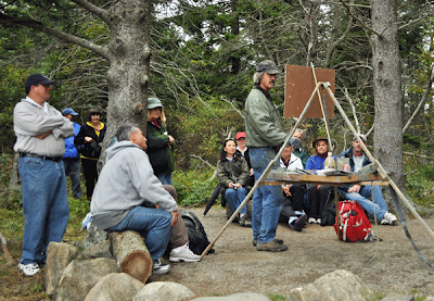
Here is a shot that one of the students e-mailed me. I am doing a demo on the second day of the workshop which was gray. It was drizzling a little so we set up under these huge trees that sheltered us from most of the rain and were able to continue to work outside.
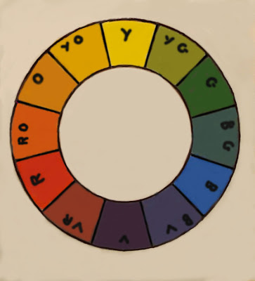
Below is nice Mr. color wheel. Tonight we will talk about near complements. When you choose three notes in an orderly way from the color wheel you form a triad.
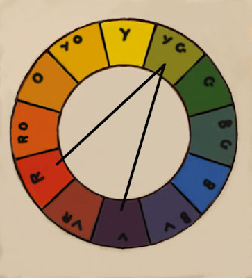
 This color wheel shows a near complement. The complement of one of the colors is omitted and it's two flanking colors are used.
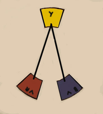
Below is a near complement. The yellow is offset with the colors on either side of its complement. As we learned not too long ago the two colors on either side of a note can be mixed to form a version (albeit grayed) of the note in the middle. But there is a significant difference when you do this. A color mixed with its complement is merely reduced. It has the same effect as adding gray. Colors mixed from near complements have a range of color. That range is not a wide one, but it does allow color harmonies rather than only reduction of the color.

Here is another near complement. Whole landscapes could easily be painted from this selection. It is a color chord. Just as an arrangement of complementary notes form a chord in music, they do the same in color. That chord might be harmonious or discordant but it IS a chord.


17 comments:
I always like the comparison of painting to music...chords..harmony...vibrations...nocturnes...high key...low key etc. In music terms, I tell people , when they ask, I paint jazz.
Wow, everyone is wearing jackets or sweatshirts and long pants! I am jealous. We won't get to do that for a couple of months.
Stapelton:
You said in this post that mixing a compliment (or near compliments) into a hue is the same as adding a gray to lower the saturation of the original hue. This isn't quite true and may mislead some of your readers. A premixed gray has white in it and this will change the optical quality of the resulting color. If all one's color mixtures contain some white then this isn't much of an issue, but if an artist likes to work with a varying degree of transparency then automatically adding grays will destroy that transparency.
Always a great blog Stapelton. Don't know how you find the time to paint, teach, and write on a daily basis.
Thomas
These near complements, also called split complements seem to have another property: one is cooler than the other. I have explored the usefulness of this by deliberately underpainting using split complements of the initially observed hue. The process of doing this in a landscape can be made practical if a poster study of the landscape is done in close-to-primary hues. I'm still wondering if this process is an unnecessary complication of the already difficult task of painting a landscape!
Tom:
Not to try and steal Stapelton's thunder, but underpainting with a complement (apologies for my earlier misspelling, hadn't had my coffee yet...) was a common practice among the signature French Impressionists. In general, the Impressionists would lay in an underpainting using a thin wash so as to not make the following layers more difficult. (The Italians called it an imprimatura.) In many of Monet's works, he'd also lay in thicker flecks of that complement adjacent to his local color, to reinforce a contrast in Hues, which created that flickering surface he and his compatriots were known for. Of course, there was much more than this going on, but many of his paintings were started with this wash.
We can see something similar being used today with many plein air artists who lay in their block-in using a wash of Iron Oxide Red, or equivalent. Iron Oxide, while technically being a tertiary, has a very strong sense of dark orange. Seeing bits of the color peeking out from underneath your greens and blues will heighten the effect. If you have't tried painting with IO give it a try. From what you wrote, I think you'll like it.
Thomas
STAPE,
Let me say how gratefull I am to have taken your workshop. I always walk away as a better painter after seeing your demos and listening to your teachings and just observing your every move.
You are a master teacher and painter , THE BEST OF THE BEST, and I am lucky to know you .
JAMES
I am happy to see you're back to the color thing. I am all ears... please keep going.
@Tom Kitts: Stapleton doesn't have a TEE VEE...
marian;
As you know Whistler was big on those comparisons. Go, Lowell Mass!
.............Stape
Simone;
It was wicked cold at night.
..............Stape
Tom;
I think it is good to learn this stuff,it helps you to know your way around the palette.
.............Stape
Thomas;
Good comment. Do you use the Rembrandt IO?
.................Stape
James;
Thank you. I am glad I was useful.
...Stape
Willek;
I intend to do a bunch more on the color wheel and it's combinations.
........Stape
Candy;
Nor do I have any internal organs.
.................Stape
Thomas;
Good comment. Do you use the Rembrandt IO?
..............Stape
Post a Comment