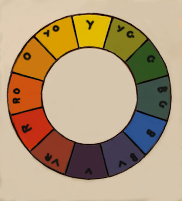
 Here is the color wheel again. I was asked by a reader what pigments I used to make it. I set out to make it using only Cadmium yellow, permanent red and cobalt blue. I discovered though that I needed to use a little cobalt violet to get the violet to show and I used a little quinacridone over in the red-violet, I also fed a little cadmium orange into the orange note. I think if I had used quinacridone red or permanent alizarin all the way through it would probably have worked better. But I wanted the colors to be real clear and distinct in order to clearly illustrate my points.
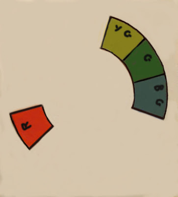
 Here is a analogous color scheme plus a complement. This is a very common color scheme. We have all seen the lady in the red hat dropped into a green landscape. The eye is very pleased to find a little bit of the complementary color in a picture based on an analogous scheme. If you look at the color wheel at the top you can pick out several more of these. The greens against red is only one of the possible variations on this.
The analogous plus a complement is a real workhorse combination and is a sure fire way to get a simple, pleasing color scheme in a painting.
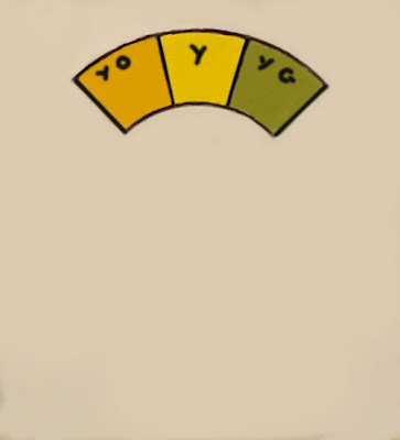
 Above is a corner of a color scheme that I want to tell you about. This is really a strange thing. We usually are told that primaries are not mixable, they just ARE. But if you mix together the colors on either side of a primary, you get the primary. It is somewhat grayed, but there it is, just the same. In other words if you mix the two colors flanking the yellow note, you will get yellow. Weird, huh?
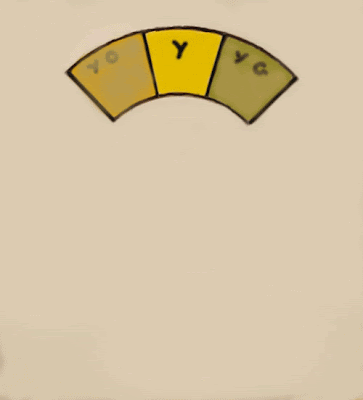
 Here is another variation. Rather than each of the three hues being identical and evenly balanced with each other, two of them are subordinated . The yellow is the dominant and the two flanking colors are reduced in chroma. This gives artistic inequality. With one the dominant and the other two subordinate a more artful effect is gained.


13 comments:
wow, that is fascinating about mixing the two flanking colors and getting a primary. That approach (with the yellows) might be just perfect now as the leaves are turning.
You just blew my mind with this one. A great set of posts Mr. Kearns.
I agree with Lucy that this could be very useful for the fall, though this year the color of fall seems to be mostly dried out, dead brown.
I think I can explain how colors adjacent to a primary could mix to give a dulled form of the primary. Realize that the colors we see reflected from pigments are not pure in the sense of having a single wavelength or narrow band of wavelengths. That can only be achieved with a light source, using things like prisms, gratings, or lasers. A cheap laser pointer, for example, gives red light that is virtually all at a wavelength near 670 nm. Each color we see from any pigment has a reflectance spectrum composed of a broad continuum of wavelengths with varying intensities. Taking Stape’s example, the yellow-orange has a red component in its reflectance spectrum, and the yellow-green has a blue component. When mixed, their common yellow component is preserved, but the red and blue components make a purple, the complement of yellow. Because the mix has the complement of yellow, the resulting yellow is grayed. Incidentally, I use the word purple here, rather than violet, because purple is not a pure monochromatic color, but rather the presence of the two colors red and blue. These have wavelengths from the opposite sides of the visible spectrum. Violet, by contrast, is neither blue nor red, but a color in its own right. It lies at the extreme end of the visible spectrum, beyond blue and indigo, with the shortest wavelengths (highest frequency and energy). There is no pigment I know of that reflects anything like a pure violet. At shorter wavelengths, the light is ultraviolet and invisible to human eyes. None of this, I realize, will keep artists from using the words purple and violet interchangeably.
Good post Stape. No offense meant Bob but I think the best explanation for this is done with a palette knife. There really is no substitute for charting color. I make my violets with veridian and a violet leaning red, often my blues too, wonderful overcast skies. That's what Bob is talking about but seeing it is much more powerful than talking about it. I think that on we can get caught up in the theory of light and color and loose the subtlety that is best discovered with a palette knife and an open mind.
Bob, Steve, both you two should take a bow! I like both comments!
I'm with Lucy & Richard though, another great post Stape!
The apples are already ripe, I'm going to have to pick em. I got a box of them for ya! Mmmmmm
Wonderful information. Thanks for sharing! I would have never thought to mix two colors opposite the primary to get the primary color.
Lucy;
I think it is useful in ocean water to use viridian and violet to make my blues sometimes.
...................Stape
Richard.
I guess I will have to try that too.
.........Stape
Bob;
I actually followed that! Thanks as always for your knowledge and ability to share it. You make things understandable.
....................Stape
Steve;
I guess both are useful. All knowledge is good.
.......Stape
Bill;
I like those honey crisp apples. I don't remember hearing about them until a few years ago. Are they a new variety?
.............Stape
Valerie;
I think it fits more into the obscure than the useful though.
...................Stape
Post a Comment