 |
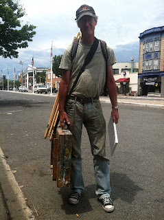
| Stapleton photo: Garin Baker, |
Here are a questions I received a few days ago;
"Dear Stape:
I learned how to mute my greens which was what I had thought was a good
idea. Now my landscapes look dead. I live in Minnesota, a state that
looks like a salad in summer. How do you handle all those greens. If I
match what I see, it's doesn't look real.
......................... probably some blonde chick
I have written about painting summer greens before and I will excerpt a few suggestions from deep in the blog as an answer for you:
I think that summer is the hardest season to paint outside. It is
just way too much green for me. I do some green paintings, but I don't
want to make a whole seasons worth of them. One or two in a show is
fine, but a whole room full of green paintings is not. I have crashed a
lot of paintings in the greenness. I always think I won't do it again,
and every year I make at least one painting that is nice, but way too green.
I
am not the only landscape painter to feel this way, lots of them have
and there are some strategies to avoid the problem. Here are a few that
come to mind.
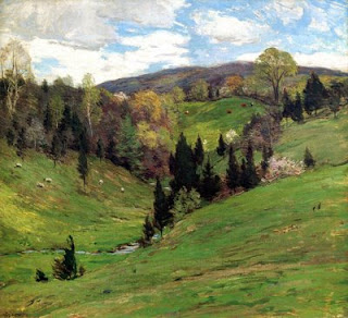 |
| Willard Metcalf image: www.artrenewal.org | | |
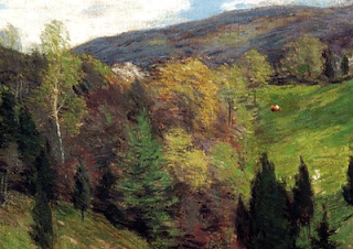 |
| detail from the Metcalf painting above showing variations in greens and addition of other colors as modifiers |
- Notice how many colors other than green Metcalf has put into this picture. The powerful blue in the sky also draws attention away from all that green by overpowering them a little. There is still a whole lot of green in this midsummer painting but there are enough other colors to counter the assertiveness of the greens.
- If you must paint in a green hell, try to vary
the greens and tone them down too. A green plus red is called olive,
Savor those, the more red you can smuggle in there the better. The
violets in the shadows aren't green either so they also serve as a
foil. Ask yourself would I wear this color? There are colors in
paintings you wouldn't wear, but with the greens the question is more
relevant.
- Historically artists have turned their backs to the
green. Many of the art colonies of America started in seaside towns.
Artists who painted the hills of New England in the fall and winter
painted the harbors or surf in the summer. The ocean is a great place to
be when it is too green out there.
- Woods and fields can be a
nightmare, but in the evening the lengthening light and the gathering
darkness begin to drop the saturation of some of the green. In the late
hours lots of too green places become paintable.
- Gardens are
great place to paint in the summer. They are green but if you have
flowers, paths, shadows or evening light, there are endless good garden
pictures to be made. Most people who have fine perennial beds are
flattered and will to allow an artist to paint their gardens. I have
knocked on strangers doors.
- Try to look for big shapes that
aren't green, such as a colored house or a yellow field or gray out
buildings, any thing that you can use so that at least an important part
of the canvas isn't painted green.
- Another solution is to
cripple your ability to mix green. Restrict yourself to an earth color
palette or at least mix all of your own greens from ultramarine. If you
are restrained in the presentation of the greens in a landscape rather
than literal, usually better paintings result.
- Sometimes it helps to stain your canvas with a
warm earth color before painting, you might rub it down with burnt
sienna and a little solvent, using a paper towel. The influence of that
wet layer of sienna particularly if it gets into the notes lain onto it,
can be a welcome modifier when things go green.
- Chromium oxide green, (PG17) is a chromium color related to viridian, it
is opaque, permanent and a dull green -yellow . It is a useful
landscapists color. I think Metcalf used a lot of it. Give this color a
try if you are experimenting with greens, it is not too powerful and
goes well with earth colors.
- The three color guys from out west, pack ultramarine, permanent alizirin and cadmium yellow, and taking a cue from them I have made a lot of
greens in recent years from those. That has the advantage of not
yielding greens that are too assertive. In the summer particularly the
landscape can be VERY green. If you want that very green look, you can get it with viridian and cadmium yellow light. I was taught to make greens that way, but I came to feel later that although they looked like what was in front of me, they were
to assertive and monotonous. In have tried in recent years to keep my
greens well in check. I sometimes have joked in this blog about painting
in the color of 500 dollar suits. You don't see those loud green suits
on the racks at Brooks! You do see some green nylon parkas out there
that are the colors I am talking down, they come from the discount
stores though.
- We are making paintings to go into peoples homes and be lived with, at least I am,. Some artists are making paintings to impress other artists or to go into museums or whatever, but I expect people to live with mine as decorative objects. I therefore don't want them to be the color of a granny Smith apple.
- I do a lot to replace it or shade
it towards red to tone it down. I often push my greens towards olive or
ocher or heat them up or purple their shadows. I don't want to make
paintings that are green all over, so I smuggle red. There are three
colors, blue, red and yellow. Green contains blue and yellow so I want
to use as much of a different color from those two as I can . That
leaves red. So I smuggle reds. That is, I try to sneak it into my greens
to "step" on them and get greater variety in my color rather than
green, green, green.
I am particularly wary of a certain green that occurs everywhere in
the lights during the summer. It is a high key chartreuse color most
easily made from a combination of lots of white, plus viridian
and some cadmium yellow light. Note I am not talking how to "hit" a
given color outside. I am talking about modifying or even replacing the
actual note of nature with something I think will make a more attractive
painting. You have heard me speak of design a lot, here I am designing
my color. Sometimes I want my paintings to be the color of 500 dollar
suits. High key lemon greens are not something I would want in my suit.
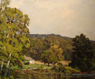
| A painting of my own with varied greens |
 |
| detail from the picture above |
Here is the middle of the painting. I would like to point out a couple of things here. One is that I have
deliberately painted different passages separate colors. I could have decided to take a
tonalist approach and make them, all
similar
or closely related, I often do. Each of those brushstrokes is a
different color than the ones around it. Look at the small green tree in
the center of the detail. Above it is
another tree that is ocher
colored, above that the hill is a
grayed olive color, in several variations and then the top of the hill is covered in pines that are an ultramarine color. Look along the water line at all of the reds and
sienna I have stuck in there. They enliven the passages and form a nice foil for all that green. Look to the right of that middle tree. See the streak
of light running in front of the big white pine down to the water? It is hot.
I am doing something here I call "smuggling red".
One
of the things I do to landscapes to make "em" cooler, is smuggle red.
Let me explain that to you. Blue and yellow are easy to see in the
landscape, the sky is blue, the foliage is green ( blue and yellow )
surfaces in the light , dry grass and other things in the landscape are
yellow. But red is more hidden. It tends
to be woven into everything else. Often as a
modifier. You don't see it out on its own as much as the other two, but its there just the same ,
woven into everything else.
Good color in landscape painting often calls for
recognizing the role various reds have in the color notes of the painting.
There's
a story about a venerable New England painter who taught a lot of
workshops. At the end of a long day he would run up and down the line of
students, outside at their easels when he was tired and he would just
say to each of them "more red, more red!" It sounds silly but it was
more than a joke, because it WAS good advice. Almost every learning
painter fails to get enough red into a painting. I try to weave a lot of
it in as it steps on all of those greens that are so annoyingly
...........green. It also takes the electric look out of a sky and keeps
shadow notes from being too icy. Red is a wonder product!
So I
smuggle reds. I am sneaking it into things, feeding it into other
colors. I make a hot pink color myself and tube it up. It is the exact
opposite of the color of green leaves and grass in the sunlight. I like
to step on my greens with it, but it also goes nicely into skies and
other places too. Some of the old landscape painters used to carry a
color then called flesh, now called
Caucasian flesh, I believe, for a similar purpose. My hot pink color is nothing like the old flesh color but the principle is the same.
Green is everywhere. I do a lot to replace it or shade
it towards red to tone it down. I often push my greens towards olive or
ocher or heat them up or purple their shadows. I don't want to make
paintings that are green all over, so I smuggle red. There are three
colors, blue, red and yellow. Green contains blue and yellow so I want
to use as much of a different color from those two as I can . That
leaves red. So I smuggle reds. That is, I try to sneak it into my greens
to "step" on them and get greater variety in my color rather than
green, green, green.
I make up a custom color for myself that I think of as the anti-green. I call it
Pornstar
Pink. It is a hot pink with indelicate overtones of chewing gum and
feather boa with a hot undertone that is nearly biological. This cheap
lingerie color is the opposite of the green outside, and is the
antidote. I can throw it into any of the mixtures I use to make greens
and it will reduce or "step on" that green. I feed it into the painting
here and there to "smuggle reds".
Painters I knew years
ago
sometimes carried tubes of "flesh color" into the field. They would
never have used "flesh ( now I believe it is labeled "Caucasian flesh")
in a portrait but it was really handy out doors. My homemade mixture,
Pornstar
Pink is a lot more vibrant than the old flesh color but the idea is the
same, a red modifier pigment. In the winter this is a good color to
have for painting snow, too
When I make this color I tube it not only for myself but for a
friend or two who liked mine when they tried it. So I make about a quart
at a time. I have experimented with it for a number of years and have
arrived at a formula that works for me. But you probably don't want to
tube paint, so there is this,
Williamsburg Persian Rose
I started out using Persian Rose and then formulated my own version
over the years from a mixture of precursor pigments I buy from
RGH, my paint supplier. Their link is over in my sidebar.
............................................................................................................................
If you would like to know about the upcoming July workshop in New Hampshire please
click
Here.
I have included the cost of the workshop and information on the
location in the White Mountains. I can teach you a whole lot, and
probably save you years of screwing around. Why torture yourself ? Don't
get left behind! You are worth it! Everyone's doing it. Act now.
I will teach about how to deal with greens in the summer landscape by applying the ideas above and a few others, from the secret premium knowledge.
I have been developing a series of painting exercises to teach root
skills. I have a bunch of them now and am adding them into the
workshops. I set my easel up in front of the class and lead them through
a painting exercise that will clarify either a skill, technique or
principle. I will be presenting one of these each day at the July
workshop.


